Menu

Wokingham Decorating Services - Reliable, Experienced Decorator based in Wokingham

Blog posts : "Colour Thoughts"

Looking forward to 2021

It's probably fair to say that 2020 was a bit of a strange year. Speaking personally, I went from being busy, to having two months off completely, to being really busy again, and then having to stop work early just before Christmas due to the virus. But there was a lot to be thankful for - myself and my family managed to stay fit and healthy, I met a lot of lovely new customers, and was fortunate enough to be on the receiving end of some very complimentary online reviews. So it wasn't all bad.

But as I take a slightly extended (who knows? Maybe it will be very extended!) Christmas break, it gives me the chance to put virtual pen to cyber paper once more and create one of my very infrequent blog posts. So it's time to look forward now to 2021 and take a look at where the trends in decorating are heading. This year, as well as all the manufacturers' (often contradictory) contributions with their colours-of-the-year, I'm also going to throw in some of my own personal thoughts, and also share some of what I've seen on various decorators' forums (so a "real time barometer" of what real decorators are actually doing out there in the real world).

I'll start with the usual caveat though - there are no "right" or "wrong" answers to the "how should I decorate my living room?" question. Every room is different in its shape, its layout, its furnishings, how it is used, the lighting, and so on, so there can't be hard-and-fast rules that work for every room. And so much of it is down to personal taste, and you as the customer are the one who will be living in (and hopefully enjoying) the room for years to come, so the most important thing is that you like it, regardless of what other people think or what is currently thought to be trendy.

So, having said all that, what do the big paint manufacturers think is in store for 2021? Actually, before we get to that, maybe we should review some of their predictions from the last few years. Dulux's colour for 2020 was "Tranquil Dawn", and I have to say this one proved to be quite popular. Some of their previous choices have disappeared without a trace, and I have never come across anyone who has used some of them. But Tranquil Dawn - which Dulux say "sits somewhere between green, blue and grey" - was a shade that would appeal to the mainstream, and wasn't a million miles away from their "Willow Tree", which had always been one of there most popular colours.  I personally used it in two jobs this year, so it clearly had an appeal to people, not just to Dulux's panel of experts. So yes, it may not have summed up what 2020 came to mean to all of us, but it was certainly a popular and usable choice.

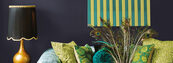
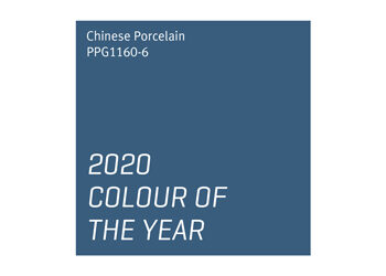
Johnstone's, on the other hand, have steered away from pastel shades and gone for strong colours for the last three years. I mentioned in a previous blog post that Johnstone's have always made decent paint, but have struggled to get the market share they deserve because frankly their colour charts were poorly laid out/designed. About a year ago they updated them, and the new ones are a vast improvement (the proof of the pudding being that I've actually used some Johnstone's colours this year). However, their colours of the year for 2018 ("Black Flame" - far right, above), 2019 ("Night Watch" - central, above) and 2020 ("Chinese Porcelain" - left, above) were all strong, bold colours which maybe didn't have the mainstream appeal of "Tranquil Dawn" at the time. However, as I will come on to discuss shortly, I feel perhaps that they will simply prove to have been ahead of their time - these may actually prove to be really popular colours in 2021 and beyond. 

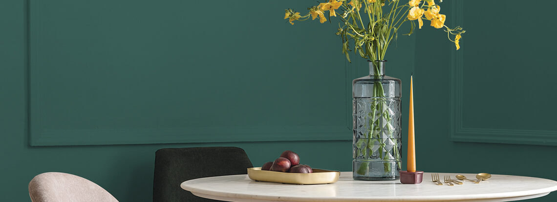
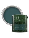
So, what do we expect in 2021 (assuming that we're not all in lockdown for the entire year, and actually get to do some decorating!)? Johnstone's haven't yet (as far as I'm aware) nailed their colours to the mast - they have published a "colour trends" document, but have yet to come up with their definitive choice for a "colour of the year". Similarly, Crown have published some "Winter 2020 Colour Trends", without actually coming out and naming one colour, although one that they seem to be using a lot in their publicity materials at the moment is "Botanical Noir", which in some ways is a strange choice, as it's not one that they sell under their main brand, but a colour that they manufacture for Elle. Two things to note which will be recurring themes throughout this blog post - rich, dark greens/blues in a flat matt finish, and wood panelling. Now take a look back at the Johnstone's colours from the past three years  - rich, dark blues and greens, and wood panelling. I'll come back to this later...

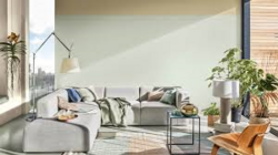
Dulux on the other hand have chosen a colour called "Brave Ground", a neutral that takes the "warm grey" trend of the last few years (think grey with a hint of brown or beige in) and just gives it a further nudge towards brown/beige. In that sense it's perhaps not a very "brave" choice, given warm greys have been so popular in recent years, but maybe we all need something comforting, safe and familiar after the trials of 2020. It's natural, it's neutral, it's inoffensive, and who am I to argue? They certainly got it right last year, and I could see "Brave Ground" being paired with a variety of other colours (see the Dulux web site for suggestions and inspiration), so it could be quite popular. Neutrals will always have their place, after all, and maybe this is just the most current neutral shade. 

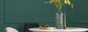
Like Johnstone's and Crown, Farrow & Ball haven't yet (as far as I know) come out with a 2021 colour of the year. Again, they tend not to make one colour the hero, but talk about overall trends. But one of their key "on trend" colours for 2020 was "Duck Green" (right). Oh look, a rich dark green in a matt finish with wood panelling. I think there might be a trend emerging here...

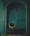
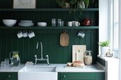
In fact, let's not put it off any more, let's talk about this now. Deep, rich blues and greens, wood panelling, one colour across the wall and woodwork - it's everywhere at the moment. Any home decor magazine you look at. Every second post on decorators' forums is some decorator or another showing off their latest work in this style. It picks up on something I mentioned in a previous blog post about how home decor ideas from historical dramas (Downton Abbey, Peaky Blinders et al) are coming back into fashion. Maybe not for whole rooms or whole houses, as we don't all live in huge gothic (or Edwardian) mansions, but used on feature walls it is a massive trend.

And I found such an amazing low budget 
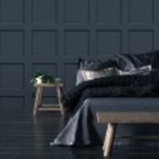
cheat online yesterday! If you don't want to commit to the full-on wood panelling, because of budget or because you think it might be a "here today and gone tomorrow" trend, well, you don't have to! You can now buy wallpaper designed to look like the wood panelling, in a variety of colours (but guess what - yes, dark greens and dark blues dominate!). Check out the  "I love wallpaper" web site - the image on the right is not real wood panelling - it's wallpaper! OK, it looks great in their publicity shot, I have yet to see it in the flesh, but I'm so excited to have found it that I'm seriously tempted to buy a couple of rolls just to try it out. As I say, if I don't like it, it'll be a lot easier to remove (and a lot cheaper to put up in the first place) than the real thing. I'll let you know how I get on with it.

So prevalent is this dark green/blue feature wall theme that I saw one decorator on a forum the other day post that "blue is the new grey"! So what of greys?  It seems that the tide may be just beginning to go back out again on greys. They have been so dominant for so long, some people are beginning to tire of them (maybe just decorators though!). There will always be a place for them, as they are so practical and versatile as neutral colours, I can't see them vanishing altogether overnight. But maybe we've reached saturation point and, after everything 2020 has thrown at us, we all need a little colour back in our lives. So don't be surprised if all the rules and all the predictions go out the window, and everyone decides to "do their own thing" in 2021, just to cheer themselves up a bit - and who could blame them?!


Go Back

Manufacturers' Colour Thoughts

Oh wow - has it really been that long since I posted anything in my blog?! Well, I did always say it was "an occasional blog", but I did mean to write more than once a year!

So what has been going on in the wonderful world of colour recently? Actually, quite a lot...

Johnstone's brought out a new colour guide. To be frank, it is a vast improvement on the old one, and well overdue. The old one felt like "We know how to make paint, and here's a random collection of colours you can have, in the unlikely event that you like any of them". The new one feels more like "We love colour - why don't you try out some of these amazing shades using our great paint products". Which is probably what a colour guide should feel like, if you ask me. There are lots of stylish photos of rooms with explanations of what colours have been used and why they work well together, and the colour "swatches" have been neatly arranged with loads of new neutral shades and some impactful brighter colours as well, including their 2019 Colour of the Year, "Night Watch (PPG1145-7)", which is a really deep, luxurious green, and is both intensely impactful and yet at the same time could almost become a neutral in a large room. There is a bit of a trend for darker, natural colours that seems to have emerged from historical TV dramas recently (from Downton Abbey to Peaky Blinders) - those period properties with the dark green or blue walls seem to be enjoying a little bit of a revival with some people, and I have to say, "Night Watch" in the right setting could be both impactful and calming. So this one gets a thumbs up from me (in the right setting), but the whole Johnstone's colour guide deserves a round of applause for moving their marketing forward in a big way. Usually I would add in a little colour swatch here to show you what it looks like, but I don't seem to be able to do it on this occasion, so with apologies to Johnstone's/PPG for any breach of copyright, here's a photo of "Night Watch" that I've "borrowed" from their web site:

So if that was their colour of 2019, where does 2020 take us (and if I don't hurry up and learn to write more frequently, I'll have to include 2021 in here as well!)? In a way they're on the same slightly retro path, but this year's colour is brighter and in a way even more impactful. It's a rich blue shade called "Chinese Porcelain", which does indeed bring to mind vintage Chinese porcelain... The thing is though, that lovely porcelain-ware was always white with delicate blue patterns or illustrations. It was blue AND white, not just blue, and when you go from the real porcelain-ware with its delicate patterns to a whole wall or whole room painted in the blue colour, it changes from being something delicate to something very impactful indeed. Nothing wrong with it, I quite like it, but it shows how when you take a colour from one setting and use it somewhere else in a completely different way it can change completely.

Enough about Johnstone's, what have Dulux been up to? Well, they too have recognised the whole Downton Abbey/Peaky Blinders retro thing, and have a separate "Heritage" colour chart in addition to their regular one. In some ways that's a good thing, as it means that if you're trying to achieve that specific look, then you know where to go to find those colours. But at the same time, part of me disagrees with the idea of "pigeon-holing" colours as "purely vintage"; yes, there are some great "Downton Abbey" colours in there, like "Midnight Teal" and "Mallard Green", but many of the neutrals such as "Chiltern White", "Quartz Grey" or "Raw Cashmere" would look great in many modern houses, and might even be the next "Polished Pebble" or whatever if Dulux would give them a chance. OK, I'm overthinking it, but there are some lovely colours in here that most people would never see unless they owned a period property.

Dulux's 2020 Colour of the Year is called "Tranquil Dawn", and they really got behind it and gave it a big push. They reprinted all their retail colour guides with "Tranquil Dawn" on the front cover, and it appeared inside too in a number of the "room makeovers"...but strangely NOT in the main pull-out colour guide where all the different colour swatches are. A bit of an oversight, maybe?! Anyway... "Tranquil Dawn" is a pale sage green - Dulux say it sits between green, grey and blue - which definitely has a calm, cool feel to it. It's already proving popular from what I've heard, although it is very similar to their "Willow Tree", which has always been one of their most popular colours. Again, I'm struggling to find or create a little colour swatch, so with apologies to Dulux for any copyright infringement, here's one of their pictures of Tranquil Dawn:

And that brings us to Crown, who have not one, not two, but three new colour guides! A retail one that you can pick up in B&Q or wherever, a trade one (which contains more technical information on their range of trade paints), and a trade "Historic & Classic Colours" guide. Confusingly, the retail colour guide includes a page on what they call their "Period Colours", but these don't seem to be the same colours as in the "Historic & Classic Colours" guide. The latter actually breaks the colours down by time period, so there is a Victorian page, and Edwardian page, an Art Deco page, and so on, which sounds like a really helpful idea initially, but when you realise that each time period only has 15 colours, it does limit your choices quite a bit if you want to be obsessive about only using the Edwardian colours (for example) in your Edwardian house. But, that said, when you look across their three colour guides, there is plenty of colour choice, and some really nice shades to choose from.

And not so long ago, that would have been that. But there are so many more paint brands available on the market these days. Farrow & Ball, of course, who also published a new colour guide - well, an additional guide as a supplement with some new colours in - last year, and Little Greene, who have been growing in recent years. But there are lots of less familiar brands on the market too, some of whom have some excellent products. I may well write a separate blog about some of them in the future (don't hold your breath though!), as many of them deserve more public recognition/awareness. One of which is Nordic paint manufacturer Tikkurila. I think they're Finnish, but I could be wrong, so don't quote me on that. Part of the struggle for me as a decorator is that they have an enormous range of products, all of which have names which mean nothing to me. It's a bit like shopping in Ikea, except that in Ikea you can see what you're buying, whereas with paint it just looks like a tin of paint! I'm used to products called "Water-based wood primer" or "Hard-wearing matt emulsion", and now I'm having to learn a whole new language and familiarise myself with products such as "Otex Akva" adn "Optiva 5". But so far it's been worth the effort to educate myself, and the people involved in selling Tikkurila - both my local stockist and the Tikkurila UK office team - have been really helpful. They have a really extensive range of colours available, and I'm trying to get my hands on some colour guides at the moment to share with interested customers. Their Colour of the Year 2020 is called "H300 Lemonade" which, unsurprisingly, is a very pale lemon yellow, which looks like a great colour to brighten up a dull space that's in need of a breath of summery fresh air.

So, what does it all mean? As I've said many times before, colour is such a subjective thing - at the end of the day, there is no "wrong or right", so much of it is down to personal taste, and if I'm decorating in your home, it's YOUR home, and I'll gladly paint it whatever colour you like. But the good news is, there are some great new colours out there, and a bigger choice of both shades and manufacturers than ever before. Or is there too much choice?! With all these options, it might take until my next blog to choose!


Go Back

Living Room Makeover

I enjoyed contributing to this living room makeover recently.  The finished result is very simple, but really quite stunning I think.

There were a number of tradespeople involved in this one. First of all, a Gas Safe engineer was employed to remove the old gas fire, which was both dated and surplus to requirements (it used to be where the TV unit now is in the above photo).  The carpet was then removed, and then I came in to fit a new length of skirting board (as there was a big gap where the gas fire had been), and paint all the walls, ceiling and woodwork. Once I left, new flooring was laid, blinds were fitted, and the new sofa was built in situ. With the whole room being decorated in whites and greys, the customer then used brightly coloured cushions to accessorise the sofa (and can easily change those to other colours as and when the mood takes her!).  Overall, quite a transformation as you can see in the "before and after" shots below:

Grey wall: Dulux "Warm Pewter" Vinyl Matt Emulsion

Go Back

Fifty Shades of Grey

OK, now I've got your attention(!), what's it all about? Surely greys are too dull and drab to be much use in home decorating?

Actually, greys can be very effective as neutral colours in a room, acting as a great "foil" for a feature wall or coloured furnishings. As a result they have been very much in fashion over the last few years - just have a flick through something like the Next catalogue, for example, and see how many of the rooms in the home furnishings sections have grey walls. Last time I checked I think it was more than 50%, and almost without exception they make all the sofas, cushions , curtains etc look great.

However, there are pitfalls to avoid when choosing greys, and not all greys are created equal...

Robin's Tips for Choosing & Using Greys

1) Come In From The Cold

Mixing greys with blues can be problematic. While the colours don't actually clash, it can result in what I call "North Sea Syndrome". You know what I mean. Think of how the colour of the North Sea on a cold January morning would make you feel, and then imagine painting your bedroom using the same colour scheme. Unless you choose a really bright, fresh blue, it's going to feel at best cool, and at worst cold and depressing. Crown have a colour called "Arctic Grey" which for me epitomises this problem - it's a mid-grey with a hint of cold blue-green to it, and every time I see it I think of Navy ships battling through a North Sea storm...


Greys can even make other colours in the room look "colder".  Look at the two boxes below - the cream squares in the middle of each box don't appear to be the same colour (but I can assure you, they are).  The one with the white border appears to be slightly "warmer", with a fractionally more orange-peach hue to it, compared to the one with the grey border, which feels a little less vibrant and "colder".


None of this need be a problem - this may be the look and feel you are trying to achieve, but it's certainly something to be aware of, and a reason why I personally don't like combining greys with creams (but this is just my personal taste - you may love it).  If you are using greys and want to avoid "North Sea Syndrome", think about warming up the other colours in the room a shade...

2) Too Much of a Good Thing...

Grey as a neutral is great at "showing off" other colours, particularly strong, vibrant tones (teal, lime green, fuchsia pink etc). Use it with "weaker" colours, and it can suck the warmth out of them (see above). So if you're going to paint your whole room grey (rather than having a strong feature wall in an otherwise grey room), make sure you have some strongly coloured furnishings. Even if you like the whole monotone idea - which can look really striking - think about including some pure white or pure black, so the whole room isn't just various shades of grey. 

3) Pure is the Cure - a Cautionary Tale

"Not all greys are created equal", I said earlier in this post. The problem is that many aren't "pure" greys, i.e. they are not just a blend of black and white. Many have a hint of blue in, or a hint of khaki or yellow ochre. "Warm greys" (greys with a little - or even a lot - of beige-brown mixed in) are forecast to become really popular. These can all be fabulous colours in their own right, but you have to be careful where you use them. Remember our old friend Crown Arctic Grey (the one that has some blue-green tones to it)? It's a great colour (see below) if that steely, cold blue-grey is what you are looking for. The trouble with greys is, they can be "colour chameleons"...

Crown Arctic Grey

The first time I came across Arctic Grey - and I should stress, I am not in any way trying to say it's a colour to avoid, or to imply any dislike for Crown Paints at all - a customer had chosen it from the Crown web site. At the time, the Crown web site had a blue background, and the little colour swatch of Arctic Grey (like the one above) looked like a pure, soft dove grey. However, the room I was painting didn't have a blue background. It had a bright red feature wall and furnishings.

Against the blue colour on the web page, the colour looked "non-blue" - by comparison with its blue surroundings, it looked anything but blue. But when you put it against a contrasting colour such as the scarlet feature wall, the hint of blue in Arctic Grey really came out, and it felt as if we were standing not in a grey and red room, but in a blue and red room. No grey at all, and definitely NOT what the customer had imagined when she'd seen the colour on the web site.

The moral of the tale? Greys are fashionable, greys are useful, greys are cool, in more than one sense. But you need to be careful where you use them, especially when they are not pure greys. So get a sample or matchpot and.... no, don't paint it on the wall. Paint it on some lining paper or white card, which you can then stick up in different places around the room to see how the grey works with the other colours you have, and with different lighting levels, and so on.  Then get in touch, and I'll come and paint it on the walls for you!


Go Back

2015 Fashion Colours

There is a certain amount of truth in the thought that colours come and go, in and out of fashion. But equally, there are classic colour schemes which always seem to work. And some modern colour schemes would look out of place in a Victorian property, just as some Victorian colour schemes wouldn't work in a modern flat.  Whether or not any of that matters to you is entirely down to you; just as in clothing, music and many other fields, some people are totally obsessed with the latest fashions, others are mildly interested, and some just stick to what they have always liked.

Personally I fall into the "mildly interested" group when it comes to colour fashion, or fashion colours. I'm fascinated by colour, especially its role in home décor, but not to the extent that I repaint my house every time a particular paint manufacturer or celebrity interior designer declares that such-and-such is this year's "must have" shade.

According to Dulux, many of the top shades for 2015 are very "earthy". Neutrals fall into two groups:

Browns are blended with ochres, sepia tones and terracotta, all colours which work well with natural woods, canvas and stone.  Combining these colours with these natural materials will create a natural, outdoors, "earthy" fell. For me, it makes me think of the Mediterranean, Tuscany, sun-baked hillsides and so on. Maybe it's the terracotta thing. 


Greys, on the other hand, while still very much in fashion, are moving away from pure greys, and being blended with hints of either blue (making them colder) or khaki shades (making them either colder or warmer, depending on how green or brown the khaki is). Given greys are so popular at the moment, it will be interesting to see how this trend develops in coming months and years.


Accent colours, according to Dulux, include oranges, berry reds (reds with hints of pink and purple shades), and yellow ochre.  These are bold, strong colours which may not be to everybody's taste, but please remember:

  1. These are fashion colours - not everyone is obsessed with being at the cutting edge of fashion
  2. They are accent colours, designed to act as highlights in a room, not to be used to paint the entire room with!


Dulux's Colour of the Year is Copper Blush.

They describe it as being subtle and versatile, and given their other thoughts on fashionable colours, I can see where they're coming from.  It could be combined with earthy browns for a warm, Mediterranean feel, or I could see it working well with berry reds, or as highlight colour when combined with the right shade of grey.  So, if you buy into their other thoughts on colour fashion at the moment, I can see how Copper Blush could fit into those trends very well.

I guess the big question is whether or not it will prove popular.  For me personally, I've always liked terracotta shades in the right setting, but their popularity peaked in the late 1980s/early 1990s. I honestly can't remember the last time I painted anything using a colour that could be classified in the "orange" segment of the colour wheel. Maybe it's coming back in - that happens all the time, colours and styles that were in vogue 20 years ago suddenly make a reappearance. Maybe Dulux have got it right, maybe not. Personally I'm not convinced yet, but time will tell...

I do think they've got it pretty right with the trends in the neutral colours though. Greys are still hugely popular and are so versatile. And now people have got used to the idea of brown shades being acceptable as neutrals, I am seeing people being willing to experiment with stronger, darker shades.  Not everyone, and that's the point.  There will always be the "dedicated followers of fashion", those who seize the latest trends and adopt them instantly.  Just as there will always be those who take their time before accepting changing fashions, and those who are happy with their own sense of style, and remain content doing their own thing.

And the good news?  On this occasion, everyone's right!  It's your home, decorate it the way you want to!


Go Back

5 blog posts

Blog Search

Comments

There are currently no blog comments.